Branding
Wellcome Trust:
in the zone
Inspired by the London 2012 Olympics, the agency was tasked with coming up with an overall concept for a Wellcome Trust science based education initiative that focused on how the body works during sport, activity, movement and rest.
Though the theme of the initiative was sports based, it was not reliant on it for its content. One of the biggest design challenges was targeting an environment where traditionally popular modes of physical activity such as football, rugby and cricket engaged boys far more effectively than girls into taking an interest.
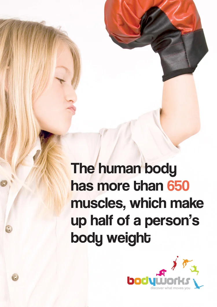
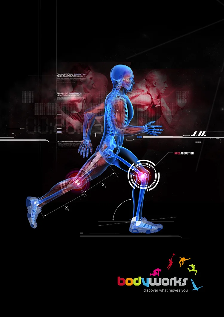
This poster is a light-hearted attempt to take away some of the male-centric bias attributed to the idea of physical activity/sports involvement—in this case, when referring to the notion of strength.
logo Iterations
The scope of the project was in a state of flux during the initial discovery phase of the project -it had at least 4 name changes - though the theme of 'how the body works' remained constant. Here are just a few examples of changes and splicing of my designs or ideas (sportworks/bodyworks/In the Zone in text masked images) and those from colleagues - culminating with the version used today.
Example of the branding used on a poster.

