
Dashboard design
grant thornton:global dynamism index
Proof of concept
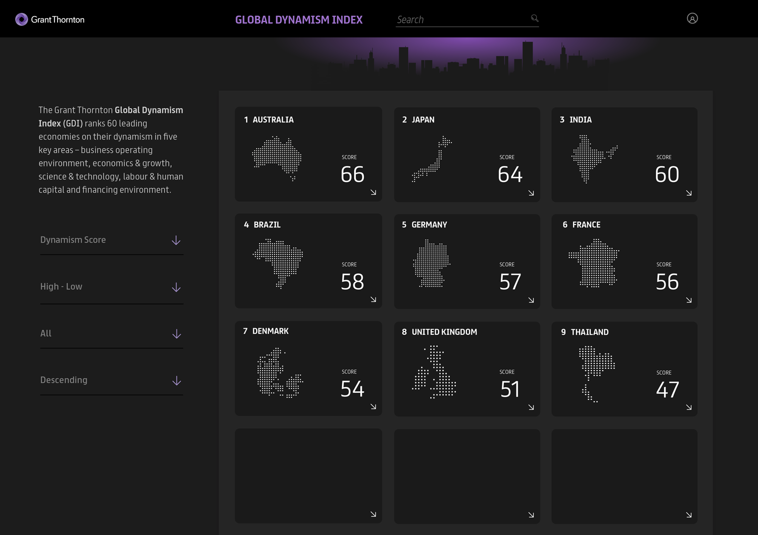
Pitch design for Professional network group Grant Thornton's Global Dynamic Index, listing the worlds 60 top dynamic economies,
The intention was to implement a design for a simple, efficient, card-based dashboard which introduced a level of engagement to the user.
The use the primary brand colour was used to subtly enhance the Grant Thornton narrative in the corporate space.
The detailed view of a chosen card can expand either to 2 or 3 rows—depending on the amount of content within, this also provides the opportunity to address a problem often seen with densely populated dashboards—minute font sizes, and use a slightly larger font size to help with legibility/accessibility.
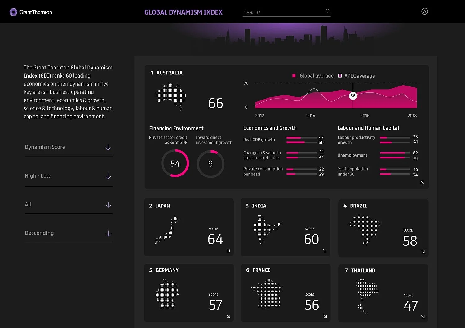
The detailed view of a chosen card can expand either to 2 or 3 rows—depending on the amount of content within, this also provides the opportunity to address a problem often seen with densely populated dashboards—minute font sizes, and use a slightly larger font size to help with legibility/accessibility.